July 27, 2004
What Media Bias?
Bravo Romeo Delta
(Courtesy Captain's Quarters and Ace del Spades)
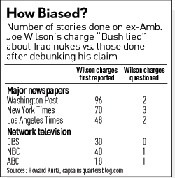
One thing that I do find interesting is the relative bias (as indicated by the ratio of the number of stories putting out Wilson's original claims, versus those indicating that the claims were disputed)* indicated by these numbers by media outlet:
| Media Outlet | Ratio of Wilson coverage |
| Washington Post | 48 |
| New York Times | 23.3 |
| LA Times | 24 |
| CBS | 30 |
| NBC | 40 |
| ABC | 18 |
*The CBS number is calculated assuming that they put out one story on the Wilson correction. If we calculate the entire set based on the assumption that they each put out one more correction story, then the series of numbers (from top to bottom) then looks like this: 32, 17.5, 16, 30, 20, 9.
This is an interesting gut check of the recent Yale study on media bias. With their estimate of ADA* added (on this scale 0=Conservative, 50=Centrist, 100=Liberal), the numbers look like:
| Media Outlet | Ratio of Wilson coverage | ADA Estimated Score |
| Washington Post | 48 | N/A |
| New York Times | 23.3 | 71.2 |
| LA Times | 24 | 63.5 |
| CBS | 30 | 65.1 |
| NBC | 40 | 60.9 |
| ABC | 18 | 53.3 |
*I'm using the numbers from Table 9, left-hand column from the report.
The interesting thing that I'm seeing about this is the tight way this is tracked. If we look at the standard deviation between (1/ratio) and the ADA estimates, the r value is -0.365 (a poor correlation), while if we look at the ratio itself and the ADA estimate, we get 0.158 (a weak, but positive correlation). Now, there are a couple factors to consider here, one being that the time frames used to evaluate the media outlets were, in no way, shape, or form, similar to the time frame used on the Wilson count. For example, the CBS sample used in calculations covers 1990 to 2003. Secondly, this is an incredibly small sample size (in the social science world) to get too excited about. Third, the sensitivity to the number of stories is so huge that it is a very badly behaving function.
All that said, I find it fascinating that, at least at first glance, the more liberal media outlets tended to report on this a bit more than their more moderate counterparts.
Launched by Bravo Romeo Delta at July 27, 2004 10:46 PM» marcland Retaliates with: Media Bias? Inconcievable!!
Wow.
On the other hand, story selection is only one indicator of bias. I find WAPO much less bias in the content of their stories than the NY Times.
Posted by: Rusty Shackleford at July 28, 2004 03:32 PMThanks for laying this out. As you say, it's a small N and the metric for the Wilson story is pretty rough. If, for instance, you assume a yale score of 60 for WaPo and then switch the Wilson scores between only two pairs:
CBCNBC
WAPONYT
You then arrive at a correlation of 0.9! The point being that the correlation is very sensitive to a rather imprecise metric. About the most you can say for the Wilson metric, and it's actually quite a lot, is that it's very very high. A "fair and balanced" news service would almost have to reach a ratio of around 1 or 2.
More disconcertingly, perhaps, is the fact that a relatively modest shift in ideology for a news service (they're, as a group, somewhat more conservative than Democrat congressmen in general) results in such an extraordinary reporting bias.
The good news is that if news services employed better or more rigorous method their ideological bias probably wouldn't matter so much.
BTW, I wonder what the FCN ratio was?
Posted by: Scott at July 29, 2004 02:42 AMScott,
This is one of the things I love about blogs, I can noodle on back-of-the-napick stuff out loud (things that would have gotten me beaten by a professor, had I ever tried it on a paper).
But getting to the essential points, this kind of data gathering and critical examination could be the kind of shift in thinking that is needed to make media relevant in the next century.
Posted by: Bravo Romeo Delta at July 29, 2004 04:41 PM